When it comes to product photography, it’s incredibly important to always stay up-to-date with the latest trends to help you gain an upper hand over your competition. After all, when customers browse products, the first thing they tend to see is photos of your products. They need to be clear, detailed and even show the product being used in order to give them a better understanding of how your product can be used.
However, product photography is about a lot more than just taking photographs of your product. The way the photo is used and the web page that it’s displayed on will also play a role in how your products are perceived, ultimately helping you build a brand around your products. So to help you out, we’ve put together six of the most important product photography trends in 2020 that you absolutely need to master.
Minimalism is all about showing the least number of things while still managing to get your point across. The idea is to create a powerful image that can easily and quickly be communicated to the viewer without the need for excess text or items in the photograph. This is a technique used to create very clean and simple images, but it’s a lot more involved than it might seem.
One of the biggest advantages of a minimalistic product photo is being able to create clean images with less clutter. This allows you to focus your customer’s attention on the item that you’re trying to sell.
If you have a page with many different items, then it helps to make the overall layout clean and less cluttered. With a minimalistic layout, your items stand out and grab the customer’s attention with no excess items or clashing colors to distract them.
A minimalistic or monochromatic layout for your product photography allows you to add a touch of stylistic expression. Since you’re trying to convey more with less, it can be challenging to add a touch of personal style to your product photographs. The key is to make your products the main focus regardless of how little you add to the final photo, but to also remain consistent so that it becomes your brand’s signature method of taking and editing product photographs.
Color management used to be most commonly found in high-end photography, but it has trickled into product photography as well thanks to the accessibility of high-end camera equipment and software tools to help correct and modify colors in an image.
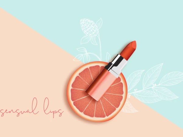
The purpose of using bright and lively colors is to help make your image pop out. When used together with colorful web design, it allows you to create a beautiful product page that attracts your audience. An important component to consider when it comes to bright and lively color usage is color psychology. This is the concept of using certain colors to evoke different emotions. For instance, red often conjures emotions of power and passion, whereas green tends to bring a fresh and tranquil vibe to a product photograph.
In 2020, we suspect that encouraging and attractive colors like Pantone Saffron 14-1064 will make a huge impact on the product photography industry. Whether it’s using the color in the background or adding a splash by incorporating lifestyle elements, there are a lot of ways to incorporate lively colors into your product photography.

Another common trend that will grow in popularity in 2020 is using natural elements in your product photographs. This has been a growing trend in stock photography for a while but we’re also seeing it appear in product photography as well. A natural setting helps to link your product with the environment, and this can conjure up a variety of different thoughts and emotions.
A good example would be connecting your product to the growing number of environmental issues in the world. For instance, a product that is made with natural ingredients can have those qualities emphasized by taking product photographs that include greenery and plants. Placing your product against a backdrop of a natural setting can also link your product with its natural roots. These same methods can also emphasize the eco-friendly qualities of your product.
Since natural elements are typically green and brown, you also get the added bonus of color psychology. Green colors tend to evoke emotions of tranquility and calmness, while brown can conjure up emotions of strength and reliability.
Here are our suggestions to utilize more natural elements in your product photographs:
- Focus on natural colors such as white, green and brown
- Include greenery, foliage, and plants in your product photographs
- Use a natural setting as a backdrop to products that are eco-friendly or made using natural ingredients
- Be consistent with your product photographs and use a nature theme on all of your products
360-degree photography is a brilliant new technology that offers your customers a 360-degree view of your product. This means you no longer need to take and upload several photographs of your product at different angles. Instead, it allows your customers to rotate a single picture to get a full view of your product.
This adds a unique touch of interaction to your photography and is relatively easy to implement. It boosts customer engagement and also allows them to get a full view of the product. This is important if your product has many different features, such as ports for an electrical device.
Another advantage of 360-degree photography is being able to offer your customers an experience that is closer to that of a retail store. In a physical store, your customers can physically touch and examine a product from different angles. In comparison, 360-degree photography doesn’t give your customers the ability to touch your product, but they can look at it from different angles. This increased level of interaction gives your customers a unique experience when shopping with your brand and can help you stand out from the competition.
This is one trend that we highly suggest taking advantage of, especially if you have products that are best viewed from a 360-degree angle. This includes clothing, tech items, small detailed item, and furniture pieces. However, 360-degree photography is versatile enough to be used on a large number of different products and we highly recommend it. Here are 10 beauty examples to spin your products left-right, up-down and magnify for close inspection.
Human-touched photography involves adding a human element to your photographs. However, it shouldn’t be confused with model photography–the two are entirely different.
Human-touched photography adds human elements to a product photograph, but it doesn’t necessarily include a human model. For instance, if your product is a piece of furniture like a table, then a way to make it human-touched would be to add items on top of the table. It’s also important to put it in a setting that would represent its actual use case. So if you were taking product photos of a table, you’ll want to include the rest of the room it’s in and dress up the scene to make it look like it’s in its intended use case.
Almost every item can appear in human-touched photography. Even clothes can have a human-touched element without needing a model. For instance, you could show just your hands if you’re selling gloves, or you could show your feet if you’re selling shoes. Technology items can also be shown in the hands of a user to demonstrate a common use case for it. There are many different ways to add a human-touched element to your photographs, and you can afford to experiment a little to see what works for your brand guidelines and personality.
Here are the advantages of human-touched photography that you can expect to see:
- Much lower cost than hiring a professional model
- Anyone can model in a human-touched photograph
- If you’re not confident in your modeling, it’s perfectly fine to blur out the human and leave the product in focus
- Demonstrates your item in its intended use case, making it great for unique items
- You can show off your product with a human-touched element
Adding a human-touched element to your product photos isn’t new, but it’s going to be a huge trend in 2020 to create interesting images with a context that could potentially tell entire stories within just a single image.Let’s get inspired to involve models in your product photos.

Lastly, we should also talk about video and its importance in product photography. While not strictly a photo, short-form videos are becoming essential for product listings because it can tell a longer story or show more features than a series of photos can. Short-form video is also fantastic for grabbing the attention of your customers and can be personalized with your brand’s own flair. This could include adding music to the video or even a voiceover.
Consumers are known to pay more attention to videos than photographs because of the element of sound grabbing their attention. Videos are also appealing to mobile users who are on the go, and they’re popular when shared on platforms that support video such as YouTube, Instagram, Twitter, and Facebook. These short-form videos are excellent at showcasing a complex product as well, such as a tech item with many different features.
Overall, while not strictly a photo, videos are a crucial part of any successful product photography strategy and should be taken into consideration if you’re planning to grow your brand and the exposure of individual products. We highly recommend that you include video in your strategy if you want to appeal to a wider audience, such as mobile customers and social media users.
Summary
Product photography has become a deep and involved process that requires a lot of research in order to stay up-to-date with the latest trends. As such, it involves a lot more work than just snapping a few pictures of your product with a smartphone. It involves establishing brand guidelines to help you create a consistent selection of product photographs.